Quiet does not have to mean plain
A room can feel calm and still contain stripes, checks, or a small floral print. The difference lies in how strongly those marks announce themselves and how many surfaces compete for attention. A narrow stripe woven in two nearby shades may read as texture from the doorway, while a large black and white version becomes the first thing you notice. Before rejecting pattern altogether, separate the motif from its contrast. Often it is the abrupt jump between light and dark, rather than the presence of a design, that makes a room feel busy.
Think about the feeling you want at the busiest time of day. A bedroom used only for sleeping has fewer moving parts than a living room full of books, toys, and changing objects. Those ordinary possessions already create pattern. The decorative scheme should leave room for them. If the household brings plenty of visual activity, a patterned curtain might work better than several patterned cushions scattered across the sofa. One contained field can feel quieter than many small interruptions, even when the total amount of printed fabric is similar.
Start with a restricted color relationship
Choose a pair of related colors before choosing a motif. Soft olive against a slightly deeper olive will usually make a gentler impression than olive against bright white. A dusty blue line on a gray blue ground can bring rhythm without looking graphic. Look at the sample from across the room: if the pattern almost disappears but the surface feels richer, you have found a useful level of contrast. This is not a rule against strong colors. A dark room can be restful when the pattern remains close in value to its background.
Use the existing room to set the color family. Wood grain, stone movement, and a marled upholstery fabric already provide subtle variation. A new pattern that repeats one of those shades can feel connected without matching exactly. Avoid selecting every color from a tiny fabric sample in isolation. Place it beside the actual floor and sofa, and compare it under the lighting you use in the evening. A print that looks muted in daylight may become surprisingly sharp beneath a nearby lamp, especially when its ground and motif reflect light differently.
Scale depends on viewing distance
A small pattern is not automatically quiet. Tiny high contrast marks can create a restless visual texture, particularly when repeated over a large surface. Meanwhile, a broad design with generous empty space can feel unhurried. Judge scale from the normal viewing position. A cushion is often seen from a nearby chair; a curtain is read from several steps away. The same motif can be pleasantly detailed on one and fussy on the other. Ask to see a generous piece of fabric, because a small cutting may omit the spacing that gives the design its character.
Imagine a compact sitting room with a plain sofa and a window behind it. A loose vertical stripe on the curtains could give the room structure without needing a patterned rug as well. If the stripe is narrow and tightly repeated, the window may instead become a vibrating grid when viewed across the room. Test the fabric by hanging the sample in folds. Patterns change when pleated, and the depth of a fold can conceal part of a motif or bunch several lines together. Flat product photographs cannot show that effect accurately.
Let one pattern set the rhythm
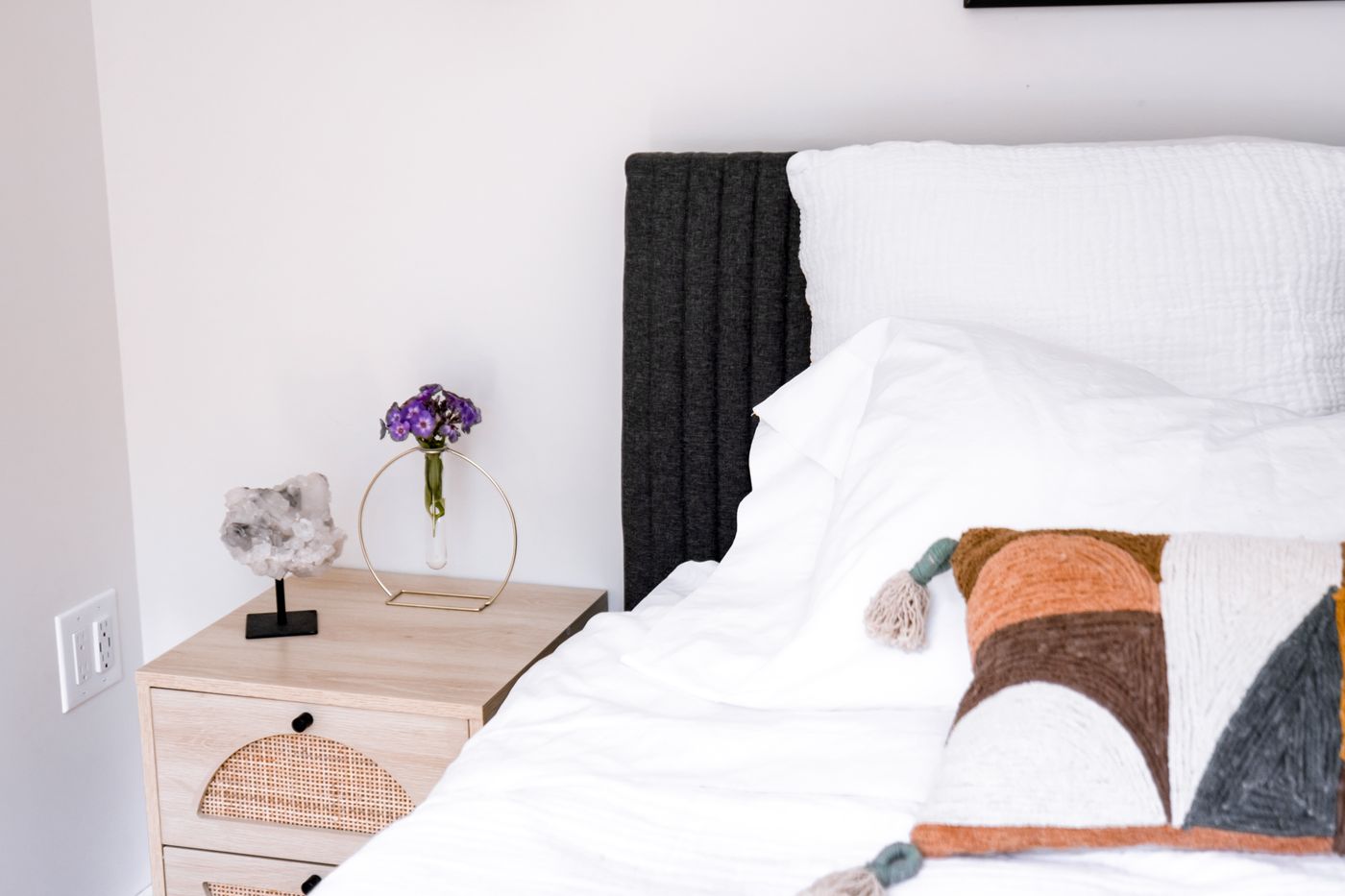
Choose a leading pattern and make the others easier to read. This might mean pairing a generous check with a fine irregular stripe, or letting a botanical curtain sit beside plain cushions with visible weave. The supporting elements do not need to be dull; they need a clear relationship to the main surface. Changing scale is often more effective than adding another color. Two similarly sized checks can look as though they are competing to perform the same job, while a check beside a broad plain field has a more legible role.
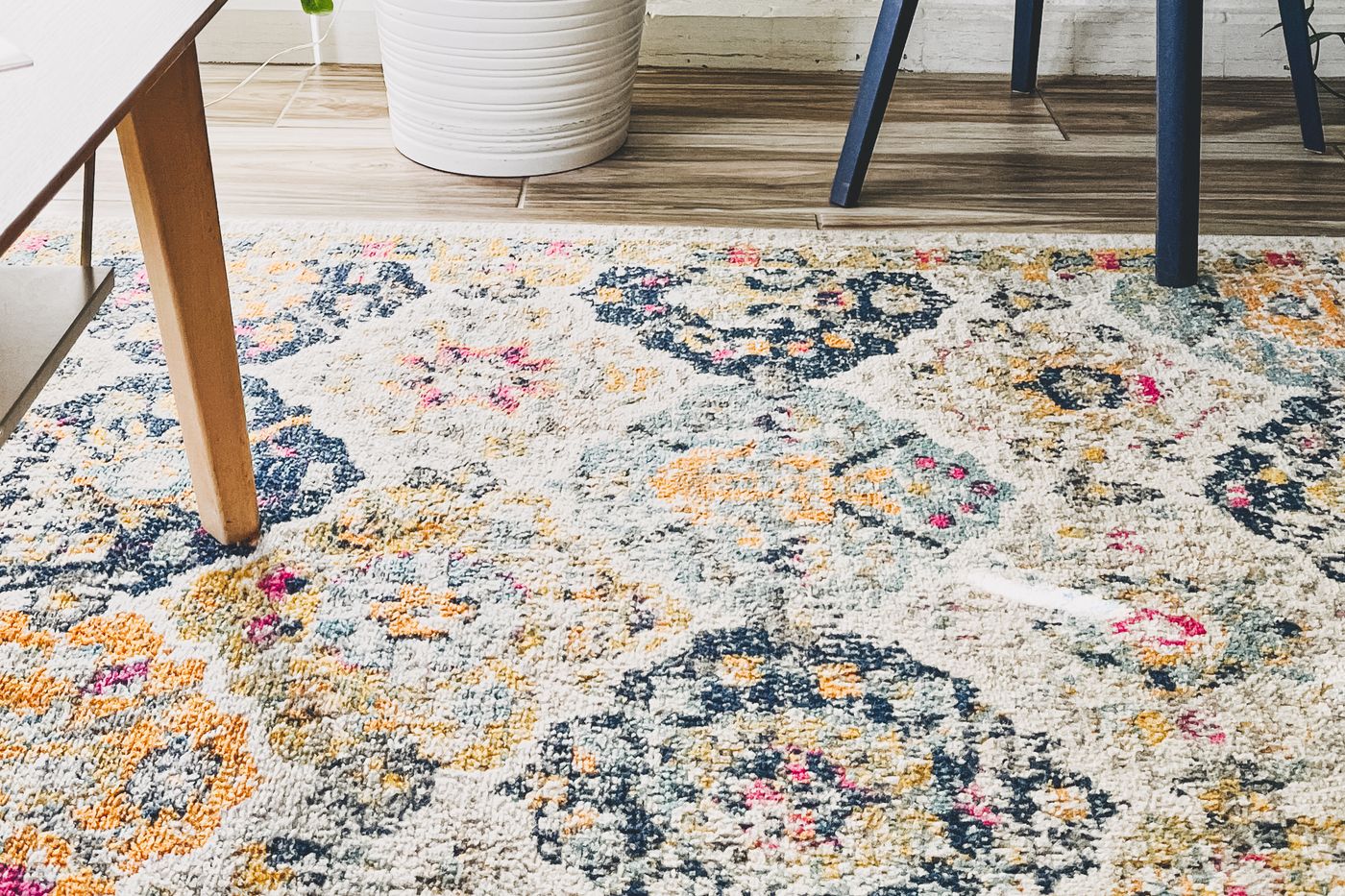
Lay the proposed materials together in roughly the proportions they will occupy. A tiny rug sample should not be given equal visual space to the curtain fabric if the finished rug will cover most of the floor. Fold or spread the samples to approximate the real balance. Then remove one element. If the arrangement becomes more coherent, that element was probably asking for too much attention. Building a calm scheme often involves deciding which attractive fabric belongs somewhere else. A collection of good individual choices does not automatically make a good room.
Use borders and edges deliberately
A border can contain a pattern and give the eye a place to stop. A striped cushion with a plain reverse, a printed lampshade with a simple edge, or a rug with a quiet perimeter can make a motif feel considered. But a sharp contrasting border also draws a line around an object. In a room with many small pieces, outlining everything may make the arrangement more fragmented. Decide whether the edge should define the shape or blend it into its surroundings. Neither effect is inherently better; they serve different rooms.
Repeat a pattern where it strengthens an existing line. Vertical curtain stripes can echo tall windows, while a subtle horizontal woven band may relate to a low cabinet. Repetition need not become literal coordination. Matching the same motif on curtains, cushions, and upholstery can remove the sense of ease you were trying to create. A quieter approach is to repeat a color, a curved shape, or the spacing between marks. That gives the materials something in common while preserving enough difference for the room to feel collected over time.
The room needs unpatterned pauses
Plain surfaces help pattern remain enjoyable. A clear area of wall, an undecorated tabletop, or a sofa with a simple silhouette gives the eye somewhere to settle. This is especially useful where shelves and open storage create their own patchwork of spines, boxes, and objects. Before adding a print, take a photograph of the room and notice where the busiest clusters sit. A patterned rug placed beneath several visually complicated shelves may feel heavier than the same rug under a plain wall. Placement can matter more than the pattern count.
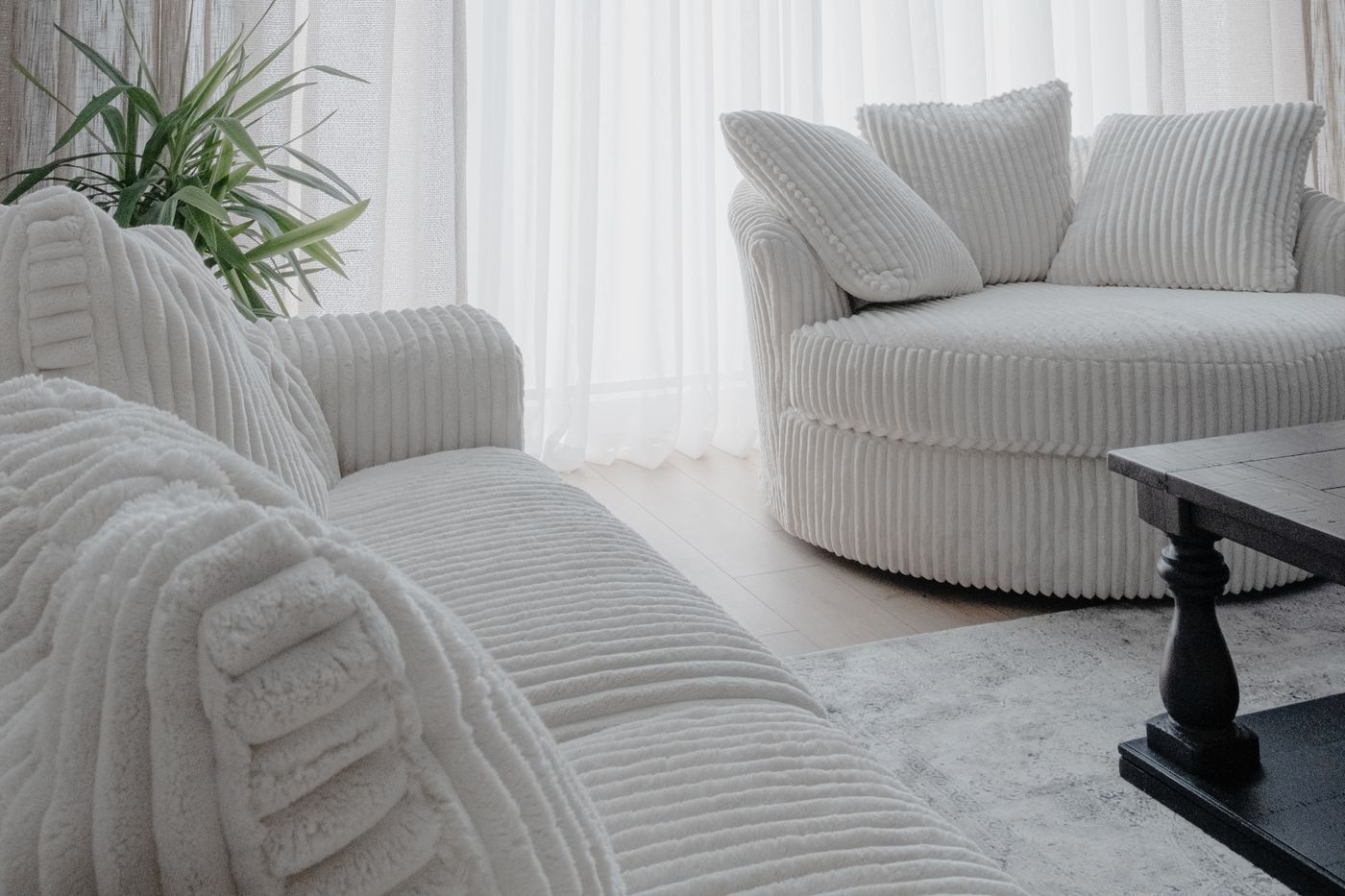
Do not confuse a plain surface with a completely uniform one. Linen, brushed cotton, irregular glaze, and wood grain can hold interest without introducing a distinct motif. They make good companions for printed fabric because they vary at a different scale. If every supporting surface is perfectly smooth, the patterned object may seem isolated and conspicuous. Gentle texture helps bridge the gap. The aim is a hierarchy of attention: a few readable shapes, several softer details, and enough open space that you do not need to inspect everything at once.
Try the reversible version first
If pattern feels unfamiliar, begin with a change that is easy to live with and easy to move. A cushion cover, a small runner, or a fabric panel can teach you whether the contrast feels comfortable. Choose a trial large enough to register. A very small accessory may look harmless simply because it is visually insignificant, then provide no useful guidance for a full curtain. Keep the trial in the room through several normal days, including evenings when the room is untidy. A pattern should coexist with daily life rather than depend on a perfectly edited photograph.
Avoid treating the first purchase as a promise to buy a matching set. You may discover that one striped cushion gives the sofa all the rhythm it needs. Or you may prefer the print on a chair in another room, where the surrounding surfaces are quieter. This is useful information, not a failed scheme. A restrained room is easier to build when each addition has time to reveal its effect. Buying several coordinated items at once can make it harder to identify which part of the arrangement is doing too much.
A quiet scheme should survive ordinary clutter
Picture the finished room with a folded newspaper, a jacket over a chair, and a glass on the table. If the pattern arrangement still feels coherent, it has enough resilience for everyday use. If every additional object makes it feel crowded, reduce contrast or remove a competing motif. The most useful test is not whether a room looks serene immediately after tidying. It is whether its visual structure remains clear when life adds a little disorder. Pattern can help with that by disguising minor wear and giving a surface depth, provided the underlying palette stays disciplined.
Make a final note of what ties the room together. It might be muted green, wide spacing, and softly rounded shapes. That description is more helpful for future purchases than a rule that says only two patterns are allowed. A rigid count ignores scale, texture, and the way furniture divides the room. A clear visual relationship travels better. When a new object fits those relationships, it can join the room without requiring you to rebuild the entire scheme. Calm comes from understandable choices, not the complete absence of decoration.
Keep a sample of the leading pattern when shopping for future additions. Memory tends to simplify colors and exaggerate how much contrast a room can absorb. The sample provides a practical reference without turning the scheme into a matching exercise. Compare relationships in person, then leave enough freedom for an unexpected object that feels at home with the existing colors and shapes.
Take it home
- View each sample from its normal distance.
- Compare contrast before counting motifs.
- Use plain areas as an intentional part of the composition.