Begin with what you cannot easily change
A kitchen palette is a collection of surfaces seen simultaneously. Cabinet fronts, a worktop, wall finishes, flooring, appliances, and metal details all enter the view, often from an adjoining living area. Choosing each one as a separate favorite can produce a room in which nothing feels wrong on its own, yet the whole looks unsettled. Begin with the fixed conditions: a floor you are keeping, exposed brick, an existing timber ceiling, or a large appliance that will remain visible. These elements have already made color decisions. The new materials need to acknowledge them.
Photograph the room, but do not rely on the photograph to judge color. Cameras and screens can change subtle undertones. Collect physical samples of the retained materials wherever practical, or compare new samples directly in the room. Notice whether the floor reads red, yellow, gray, or mixed in different light. Look for repeated colors within a varied stone or timber surface. You do not need to match them exactly. The aim is to understand the background before deciding whether a new finish should blend with it or create a deliberate, readable contrast.
Give one surface the leading role
Choose the element that deserves the most attention. It might be a strongly veined worktop, a deep green cabinet color, or a textured tiled wall. Once that decision is made, let neighboring surfaces provide support. A dramatic stone beside heavily patterned tiles and prominent wood grain can make a small kitchen feel crowded even when all three materials are beautiful. A quieter cabinet front gives the stone enough room to be appreciated. Restraint here is not a demand for a plain kitchen; it is a way to make the interesting part easier to see.
The leading surface should also make sense in the room's proportions. A patterned worktop seen mostly from a doorway may read differently from the same slab extending up a full wall. Ask the supplier how the material will be cut and which parts of the pattern will appear on visible sections. For manufactured surfaces, inspect a sufficiently large sample to understand repetition. For natural materials, review the actual selection process rather than assuming the small showroom piece represents every slab. Visual variation can be an advantage when it is understood before installation.
Undertones are relationships, not labels
Names such as warm white or soft gray are useful starting descriptions, but they do not predict how finishes behave together. A cabinet sample that looks neutral on its own may appear pink beside a greenish stone. A white appliance can make a creamy paint appear more yellow. Place the materials side by side with no bright packaging between them and look at the edges where they meet. That junction often reveals the relationship more clearly than examining each sample separately. Keep the sample board simple enough that you can identify which pairing is causing a problem.
Try the palette in morning light, afternoon light, and the lighting planned for cooking and dining. If the room is unfinished, acknowledge that temporary work lights may give a misleading impression. Avoid making a final decision under one unfamiliar lamp. You do not need every material to maintain an identical appearance all day. Some change is part of living with daylight. The important question is whether the combination stays coherent across those changes, rather than briefly looking perfect at one hour and uncomfortable at the time the kitchen is used most.
Balance the amount of each material
A sample board can make a small metal handle look as important as a full bank of cabinets. The finished room will not read that way. Think about proportions. If most of the visible area is pale cabinetry, a dark worktop may form a strong horizontal line even when its sample is small. If the floor has large color variation, it may supply more pattern than a tiled splashback. Arrange the samples in approximate proportions, or sketch the kitchen elevation and fill its main fields with representative colors. This rough exercise often reveals an imbalance before the order is placed.
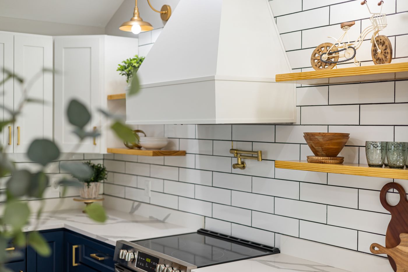
Open shelves change the palette because their contents will add more colors and shapes. A beautifully restrained material scheme can become busy when every mug and food package is exposed. Decide where everyday objects belong while choosing the finishes. Closed storage may let you use a more expressive worktop without visual overload. Alternatively, quieter fixed surfaces can leave room for a lively collection of dishes. There is no need to eliminate personality. Simply include the objects that will actually be present instead of evaluating an empty kitchen that will exist only on installation day.
Let maintenance influence the finish
Color and texture affect how a kitchen looks between cleanings. A very dark glossy surface may show fingerprints or water marks conspicuously, while a heavily textured finish may require more effort around cooking areas. Performance depends on the specific product, so ask for care instructions and compare them with household routines. Do not accept a vague claim that a finish is maintenance free. Ask what can stain it, which cleaners are permitted, whether heat protection is required, and how minor damage is repaired. Those answers are part of the palette decision because wear changes appearance.
Consider the places where surfaces meet. A busy joint between a worktop, upstand, and wall can make a simple material look complicated. Discuss edge profiles, joint placement, sealants, and cleaning access with the installer. These are not merely finishing details left until the end. A thin edge and an oversized decorative edge can give the same material a very different character. Select the visual language consistently, while allowing the installation professional to specify technically appropriate methods. Do not trade a sound junction or required clearance for an image found online.
Metal finishes need not match perfectly
A kitchen may contain stainless steel appliances, a tap, cabinet handles, lighting, and door hardware. Insisting that every metal look identical can be unrealistic, especially when different manufacturers use different coatings. Instead, decide which finishes should form a consistent group. Matching cabinet handles creates one clear rhythm; a stainless appliance can remain a practical background element. Compare samples directly before assuming two finishes described as brushed brass are close enough. One may be yellow and reflective, while the other is muted and brown. The shared name does not establish a visual match.
Use repeated placement to make a finish feel intentional. A darker handle finish appearing across the cabinetry reads as a decision, even if the tap differs. A single unexpected metal detail is more likely to seem accidental when nothing else relates to it. That relationship can come from color depth or surface sheen rather than exact matching. Also check how the finish is cared for and whether it will change over time. A surface designed to develop a patina requires a different expectation from a coating intended to remain uniform. Both can work, provided the household understands the difference.
Connect the kitchen to neighboring rooms
In an open layout, the kitchen palette is part of the living room whether you intend it or not. Stand at the sofa and assess the largest kitchen shapes from that position. A strong island color may become the room's main focal point. A worktop with a reflective finish may catch light across the entire space. You can connect rooms by repeating one material or color family without duplicating everything. A timber dining table can relate to a kitchen shelf, while upholstery carries a softer version of the cabinet color.
Flooring is often the strongest connection because it runs beneath both areas. If the materials change at the kitchen boundary, plan the transition with the relevant professionals before finalizing heights and edges. The visual line should make sense with the architecture, but technical suitability comes first. A threshold that looks elegant on a drawing can become awkward if finished floor levels were not coordinated. Ask to see the junction in the project documentation, including how the selected materials and installation systems affect it. A coherent palette depends on these physical meetings as much as on color harmony.
Approve a complete, documented set
Before ordering, bring the final cabinet sample, worktop reference, floor sample, wall color, tile, and hardware together one last time. Check them in the intended room and photograph the arrangement for reference, while keeping the physical samples as the color authority. Record exact product names, finish codes, dimensions, and any approved substitutions. If a material changes because of availability, revisit the whole combination rather than treating the replacement as an isolated administrative detail. A slightly different undertone or sheen can alter the relationship you carefully established.
Then stop collecting alternatives unless a real problem emerges. An endless search for a more interesting tile can reopen settled decisions and weaken the hierarchy. A successful kitchen palette does not need every surface to start a conversation. It needs to support cooking, cleaning, storage, and the adjoining room while leaving one or two materials enough space to have character. When the practical requirements and visual relationships are clear, the room can acquire warmth from use: a bowl on the counter, a folded towel, and the ordinary objects that make a kitchen belong to a household.
Keep spare tiles or other repair materials when the supplier recommends it and storage allows. Record the batch information where relevant, because a future replacement may differ slightly. A practical repair plan helps the palette remain coherent over time. It also gives everyday life some room: a damaged element need not force a wider redesign simply because its original reference has been lost.
Take it home
- Choose fixed surfaces as a group.
- Check physical samples at their actual junctions.
- Record finish codes and approved substitutions before ordering.